Are you using visual content within your social media posts? Want to know how you can make the most of visual marketing on Facebook, Pinterest, Instagram, and more? Sure you do! Because here's the reality.
If you're not creating visually appealing content that captures audience attention, your competition is. Graphics can tell your company story, boost awareness, and drive additional traffic to your product or service. So how can you create visual content that helps you better connect with your fans and followers?
Join me in this look at 25 brands that make the MOST of visual content on social media.
1. Volkswagen
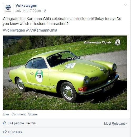
Volkswagen claims that all people and all things have a story to tell, and you see this evidenced in each of their Facebook posts.
Across their Page are visual stories about VW automobiles and their customers. Whether you want to learn about VW history, understand the heritage of the Beetle or find your next car, Facebook is the place to do it.
Each image is designed to further the culture and experience around the Volkswagen brand. Watch (and learn) as they highlight important milestones within the company by weaving a powerful story into each post.
2. Starbucks
Starbucks has a presence on multiple social media platforms, each one successfully expressing what the brand is all about.
Their use of visual marketing is bursting with personality and originality, and although Starbucks often uses posts to advertise products, it's done in a creative and subtle way.
This is a lesson many companies have yet to learn: Sometimes less is more... especially when it comes to visual content.

3. Bud Light
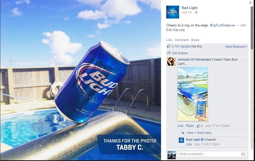
Bud Light has an active and vibrant Facebook Page ripe with visual marketing.
From colorful graphics to native video, Bud Light has created an interactive Facebook community through visual media.
And they’re not afraid to let their fans join in on the fun. They consistently invite followers to submit personal photos.
Whether a day at the beach or an event Bud Light is promoting, audience participation gives the Page a unique “small town” feel.
4. Dunkin Donuts
This brand’s visual marketing is so upbeat, colorful and delicious looking that users can’t tear their eyes off it.
Dunkin Donuts posts are 100% in line with their style: They are bright, imaginative, and cheerful. Humor makes the posts popular and shareable.
The brand never does direct advertising, instead choosing to show off their product in an unusual way.

5. Kate Spade New York
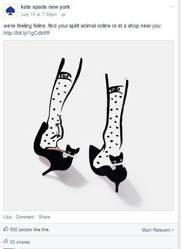
The success of Kate Spade New York lies in their use of color, which alone is key to effective visual marketing.
Since the brand specializes in bold and stylish wear, they use their posts to continue showcasing their style and their work.
Kate Spade New York’s use of graphic prints, crisp color and playful sophistication makes them a powerful presence on Facebook (and one of the most followed brands on Pinterest).
6. Target
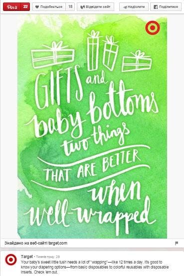
Target uses several boards on Pinterest to market their store and products. Although each board exemplifies a different marketing strategy, all of them use engaging and informative graphics.
Target doesn’t just post photos of their products, like many other brands do. They combine images with text to create fun and shareable images.
7. Nike
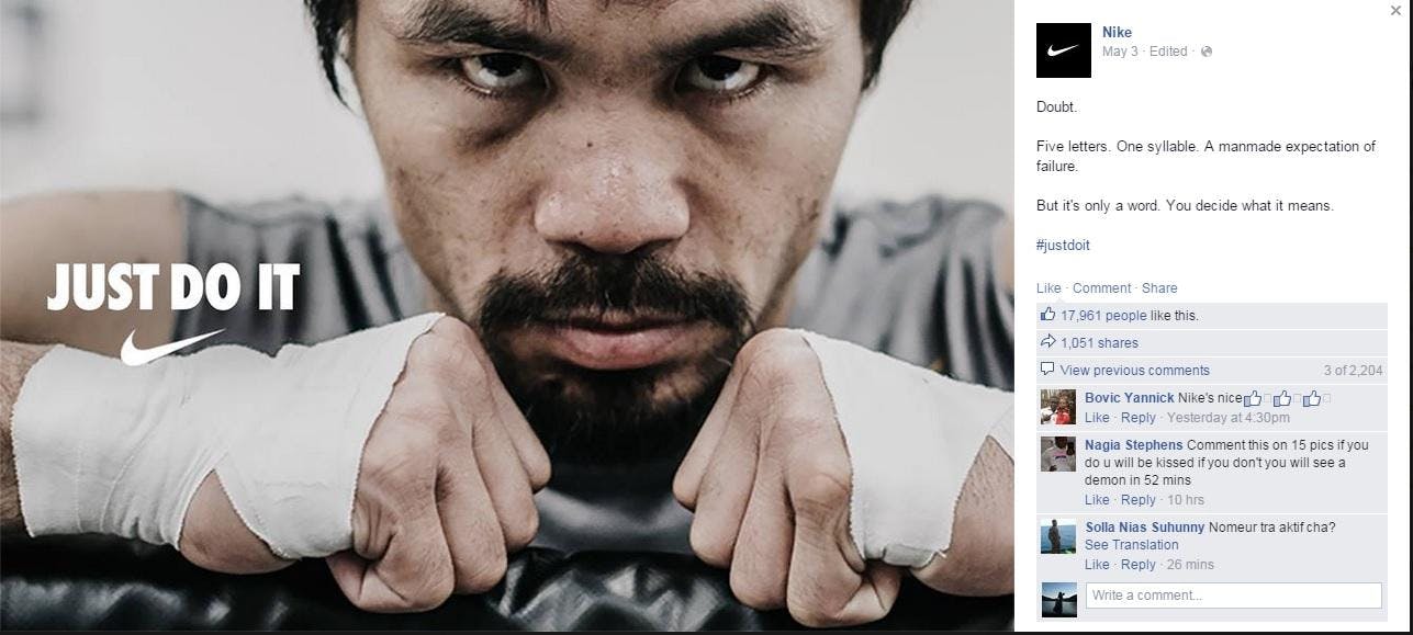
Nike understands marketing on Instagram as well as the mentality of their target audience, and they use this knowledge to effectively showcase their brand.
The brand loves to post inspirational hashtags and photos showing everyday moments related to sports. The focus is on speaking to everyone who has a dream and encouraging them to ”Just do it!”
8. Sharpie
Any creative soul will love the Sharpie Pinterest page.
Marketing a simple product with a limited variety and few uses can be quite difficult, but Sharpie has succeeded in turning its Pinterest page into something more!
Sharpie provides handy tips and creative ideas -- all of them interesting enough to be shared.

9. tHe Horse Footwear
tHe Horse Brand sells watches, but does it in a simple yet interesting way. Their strategy can be described in one word: “Consistency.” Every day, they publish visual posts on Facebook, all of them featuring different types of people wearing their watches.
The people and the places are different, but the watches are always the same. This consistency tells people what to expect and keeps them coming back each day to see who will wear the watch today.

10. Grammarly Cards
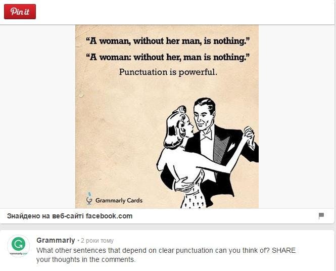
Grammarly is an online proofreading and correction service with an excellent visual marketing strategy. Their Pinterest page is filled with funny and engaging content that people enjoy and frequently share. The humor and wit are coupled with attractive pictures the Grammarly Cards audience cannot ignore.
11. Oreo
Oreo knows how to keep an audience happy and actively engaged.
The visuals the brand posts have it all -- including wit, culture and parodies. They take any popular event or entertainment update and work their cookie right into it.
This makes Oreo posts fun and shareable.
The time it takes Oreo to react to an unforeseen event is phenomenal. The brand’s fast response to the Superbowl ("You can still dunk in the dark") won widespread recognition.

12. Lisa Curry
Lisa Curry, an Olympic athlete, personal trainer and writer, is a queen of visuals.
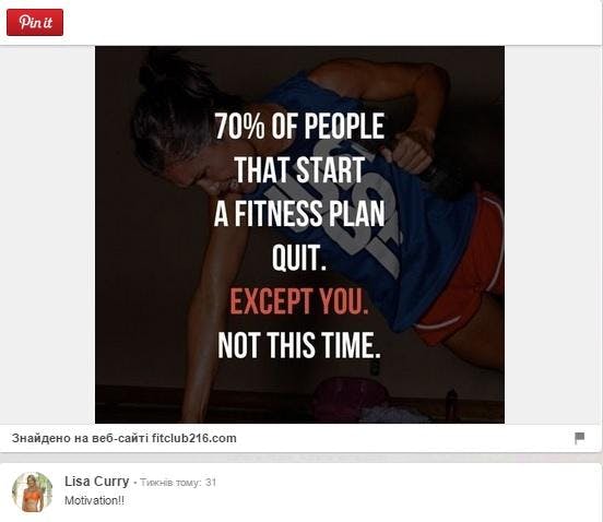
She combines great quotes with eye-catching images to create visually appealing graphics that get shared like hotcakes on her Pinterest and Facebook pages.
Lisa often chooses inspirational quotes to spread her message of health and wellness.
13. IHOP
IHOP’s Instagram page is filled with colorful and mouth-watering images that have their audience out the door and heading towards the nearest IHOP in mere minutes.
Not only do their posts show colorful and delicious-looking pictures, but they also have an upbeat sense of humor.
IHOP caters to their (generally young) crowd by posting memes, customer-submitted images and fantastic food photos.

14. Home Depot
Home Depot knows their audience, and the brand effectively markets to them. Their posts are made for homeowners and those who love creating something practical and good-looking. Their Instagram page is full of practical, original and creative ideas.

15. Dr. Pepper
The Dr. Pepper brand knows how to make their content appealing.
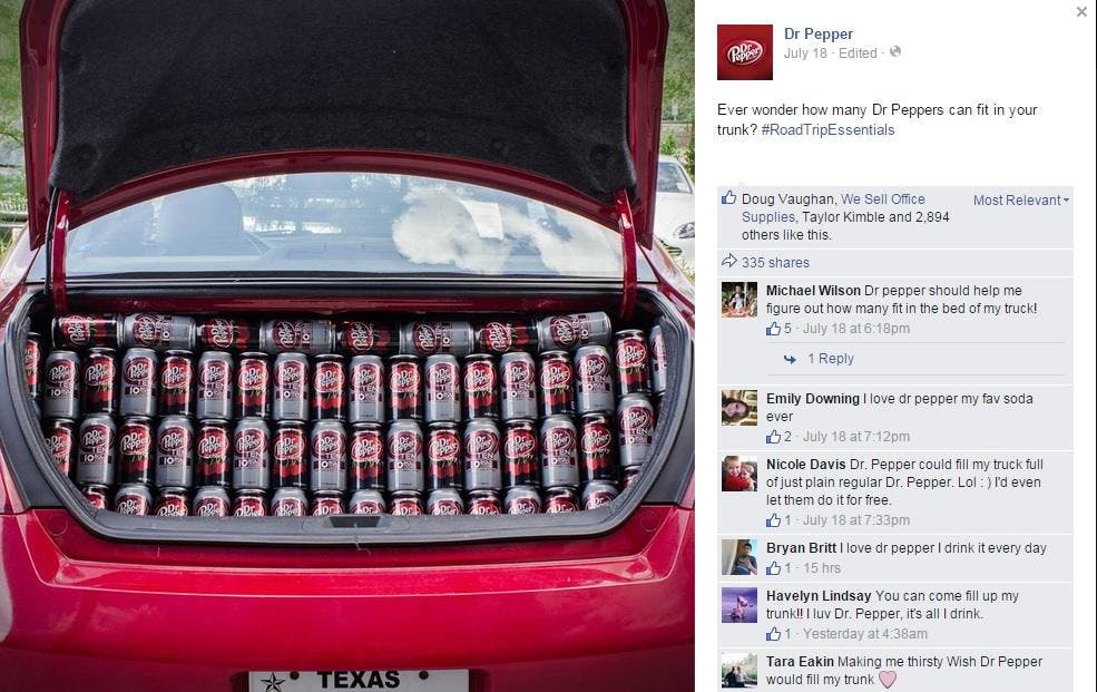
They have a talent for turning their product into great visuals that are both attractive and humorous.
The content they post on their Facebook page is proof that design is just as important a factor as written copy.
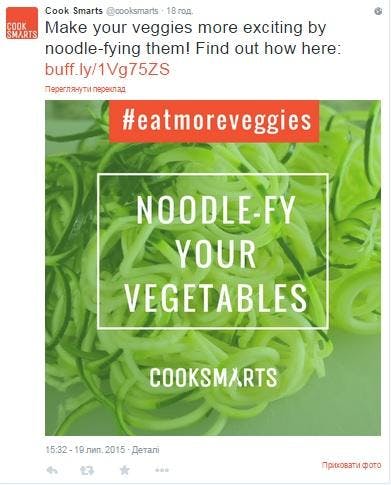
16. Cook Smarts
The graphics posted by Cook Smarts are a fantastic example of how visual marketing should be used.
Their Twitter page is full of shareables: simple images with witty and creative text.
They also have numerous infographics which provide their audience with handy tips and other info.
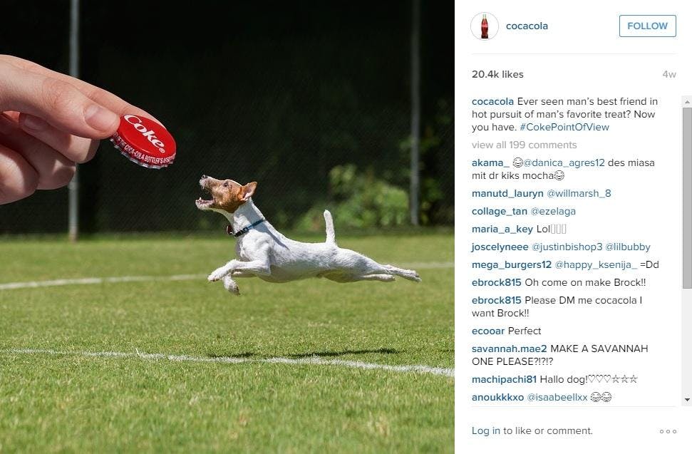
17. Coca-Cola
Coca-Cola’s content marketing strategy is built on visual marketing. They provide their audience with fun, colorful and quirky visuals that are easy to like and share.
The company concentrates its efforts on interactive content to keep their audience engaged.
Coca Cola also has uniquely designed animated gifs and plenty of brand memorabilia that reminds the audience whose page they’re on.
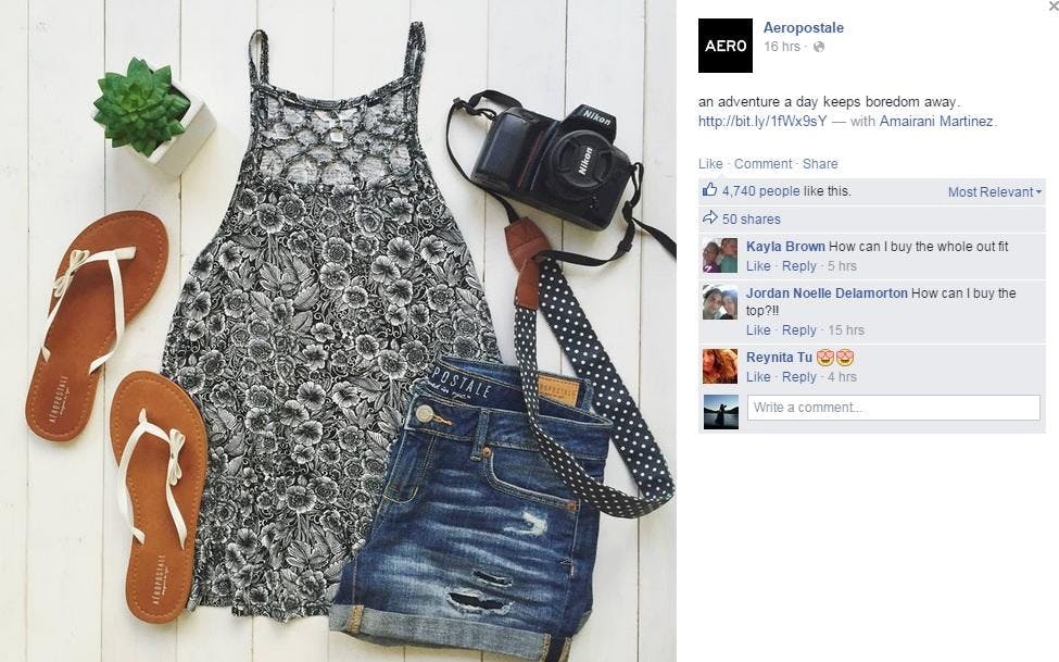
18. Aeropostale
Aeropostale knows its fashion-savvy audience and effectively caters to their tastes.
The brand posts simple, yet lovely, images featuring an ensemble of clothes and accessories that go together to create one distinct look.
Through this strategy, Aeropostale advertises its own clothes (which are at the center of the composition) gives its audience ideas about what goes well with what, and creates a definite brand look.
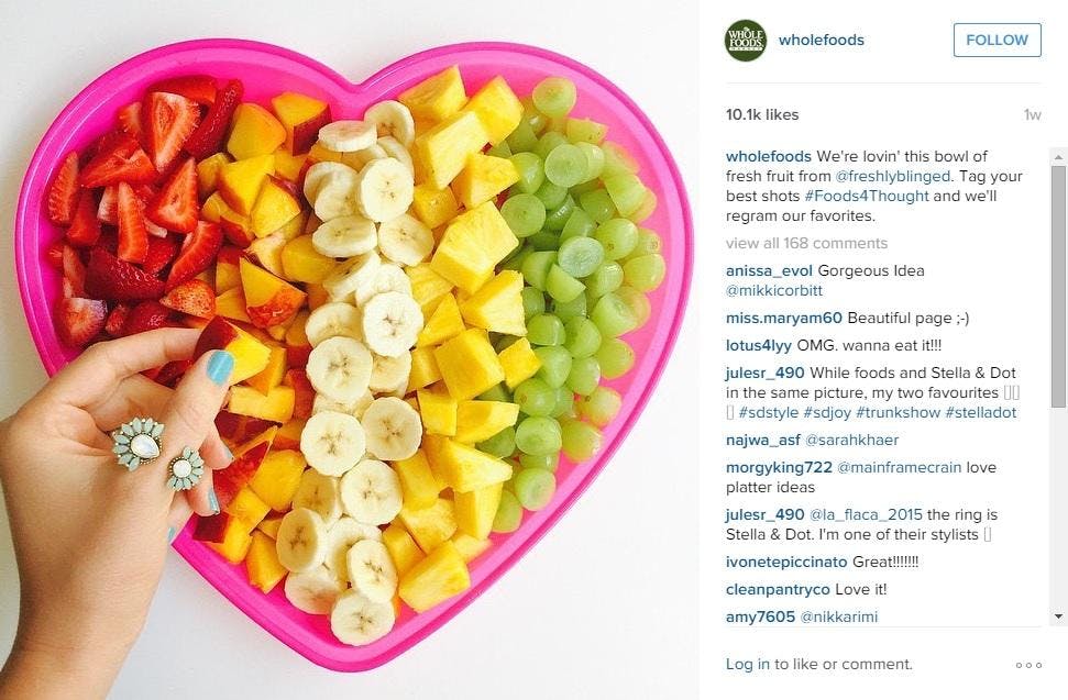
19. Whole Foods
Besides offering their customers healthy, organic foods, Whole Foods also provides followers with exceptional and informative visual graphics.
This is a brand that knows how to tell a story visually and make it appealing to all.Although they have some product advertisements, most of their posts include great images combined with valuable advice.
20. Taco Bell
Taco Bell knows how to grab their audience’s attention and keep it. The vibrant colors and artistic look of their graphics get their posts noticed. Although some of the graphics they post on Instagram are advertising their products, most simply show off the product in an artistic and attractive way.

21. AMC Theaters
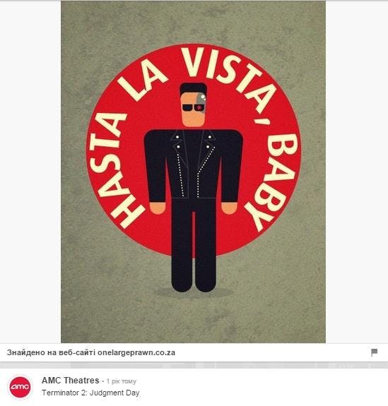
AMC utilizes a very effective visual marketing strategy on Pinterest. They transport their audience to a world of films through attractive movie-lover memorabilia.
AMC’s Pinterest posts never promote AMC directly, but entertain and inform their audience.
They also post numerous fan photos, and giveaways which keep their followers loyal and engaged.
22. GoPro
The very nature of GoPro makes it the perfect brand for visual content marketing. After all, no words are necessary to market their GoPro cameras – their photos say it all. The quality of the photos and their extreme setting help these graphics get shared like wildfire.

23. Jetsetter
If you combine Jetsetter, Pinterest and visual marketing the result is incredible success.
The brand successfully utilizes several visual marketing strategies to make their popularity soar.
First, they post stunning photography (guaranteeing them hundreds of reposts).
Then, they combine those photos with travel or inspirational quotes -- making them even more shareable among the brand’s public.
Last but not least, Jetsetter successfully engages their fans with contests -- a huge drawing card for them.

24. Honey Bunches of Oats
This cereal company has long figured out the secret of visual content marketing through social media.
All of their posts on Facebook are visual, and humor is their best weapon. Honey Bunches of Oats creates funny and memorable visuals that are easy to share.
Most of their graphics have the brand’s logo attached to it, so it continues to remind the users who is behind the great photos and the witty humor (even if the graphic is taken out of context).

25. International Delight
This iced coffee brand knows how to use visual marketing to gain popularity. They utilize several approaches.
First, they post colorful and mouth-watering photos that get numerous shares -- especially on a hot summer day.
Next, they add helpful hints or ideas to their graphics to keep their audience interested and engaged.
Last, but not least, they take visual marketing to the next level by posting cool iced-coffee-related photos sent in by their followers.
This increases engagement while making their followers feel like they are a part of the brand.

Final thoughts
While your competition might be using visual content, most companies are still falling short.
You have an opportunity to create a consistent strategy and make your visual mark.
Understand each visual social network, how it works, and what your audience is looking for. You can’t take a one-size-fits all approach.
Learn the language of that network and then create custom visuals that tell you message and unique story.
Your business can succeed at visual marketing. The key is to create differentiation and stand out among the noise. Do you have brands to nominate to this list of champs? Or observations about the ones I've listed? Let me know in the comments. Let's talk!
Originally written by Rebekah Radice and posted on Post Planner.
About Rebekah Radice
Rebekah Radice, co-founder of BRIL.LA, has traded narcissism for purpose. When not driving growth, you'll find her tricking family into thinking she's Emeril Lagasse - likely covered in marinara. The spotlight was fun, but impact is better. These days she's using 20+ years of brand brilliance for good.
