There’s no denying the power of visual content. From Facebook to Twitter, Pinterest and Google Plus – visual marketing has taken the online world by storm. And it’s no surprise.
In a recent HubSpot survey, 65% of respondents admitted to being visual learners. Add that data to a study by Wyzowl where respondents said they remember 80% of what they see, but only 20% of what they read, and it becomes clear that visual marketing is critical to keeping you:
- Top of mind
- Relevant, and
- Memorable
But knowing how to incorporate visual marketing is still a challenge for most businesses. Many wonder where to begin and how to incorporate visual marketing best practices. To answer those questions and get a better look at the effect of visual marketing on social media, HubSpot teamed up with Market Domination Media to create the Infographic below.
The data tells an eye-opening story and a cautionary tale. If you’re not incorporating visual content into your online marketing, you’re missing out on significant benefits. Add it to your marketing mix now, or watch your competition zoom by.
Visual content gets more social shares
- 43% of social media users share pictures
- Having at least one image in your post leads to more Facebook shares
- The average Facebook shares with at least one image: 64.9%
- The average Facebook shares with no image: 28%
- Having at least one image in your post leads to more Twitter shares
- The average Twitter shares with an image: 20.36%
- The average Twitter shares with no image: 9.67%
- Infographics are linked and shared 3x more than other content
Just look to Nike as an example of one brand benefiting from the early adoption of visual marketing. Their clever use of visual content, especially on Instagram, has created a flurry of activity. Take a look at their profile and you’ll see how they’ve woven brand imaging, messaging and hashtags into a very effective strategy.
A photo posted by Nike (@nike) on May 18, 2015 at 9:59pm PDT
3 keys to strong visual content
- Consistent Color Range
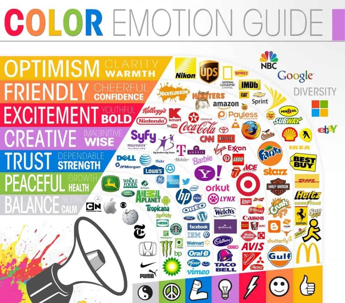
Did you know that color impression can account for 60% of the acceptance or rejection of a product or service? That's huge! While there are many factors that affect how and why consumers buy, a recent Kissmetrics study shows that color plays a major role in the decision-making process.
Understanding the psychology behind each color will help you get inside the head of your consumer and choose a color that:
- Best represents your company's social media promotional strategy
- The feelings you want to impart, and
- The action you want them to take

- Fonts that Match Your Message
Fonts play a critical role in telling your brand story. HubSpot found that using 3 font styles makes it easier to read content. I would increase that to 4 and find those that feel like you. When determining a font, ask yourself these questions:
- Is my company fun, silly, entertaining, serious, inquisitive, playful, or straightforward?
- Is my content fun, silly, entertaining, serious, inquisitive, playful, or straightforward?
Your essence is wrapped up in your branding. The fonts you choose play a big role in helping align who you are with the perception people receive.
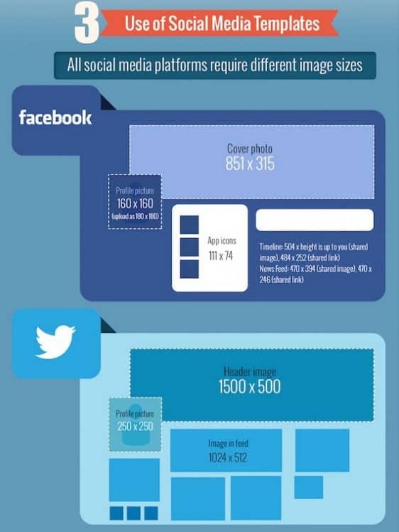
- Use of Social Media Templates
Each social network has its own style, templates, and design. Structure your content according to best practices for each site. Look to this guide on social media image sizes to create branded cover photos and graphics specific to each social network. (see the full list below)

How to create a great piece of visual content
In an online world where the average website visitor spends less than 15 seconds actively reading page content, you better know how to stand out. This is where visual content comes in. Convinced you need to get on the visual content bandwagon? Here’s how!
1. Identify an Awesome Topic
Want to gain audience attention? Create visual content that satisfies their interest and needs while highlighting your expertise.
- Source topic ideas from:
- Keyword research
- Internal sales and support
- Popular industry blogs
- Your own data/research
- Experts
2. Select the Best Content Type
Find the best type of content to engage your audience. Consider:
Infographics
- There are three types: static, motion, interactive
- Consumers are 30 times more likely to read an Infographic than a text-based piece of content.
- Generate more traffic than traditional blog posts. Each Infographic QuickSprout published generated 41,487 website visitors
Images
- Users on Twitter tweet images 361% more than they tweet videos
- Images tend to get 128% more retweets than videos
Video
- Videos increase the likelihood of your visitors purchasing your product or service by 64%.
- Videos provide an increase in your visitors’ understanding of your product or service by 74%
- Video on landing pages increases conversions by 86%
3. Create an Attractive and Effective Design
Pay close attention to each of the elements below. They play a major role in how your visual content is consumed and shared.
- Typography
- Color
- Negative space
- Illustrations
- Icons
- Accuracy
- Layout
- Comparison
- Callouts
- Simplicity
4. Identify Potential Content Promoters
Who would love to support you in sharing and promoting your content? Find your tribe!
Look to your:
- Existing social media audience
- Business partners and vendors
- Influencers
- Related industry sites and blogs
- Customers
5. Create a Promotional Strategy
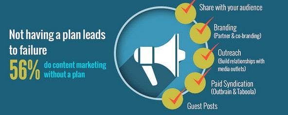
If you’ve spent any amount of time on my blog, you know what a huge advocate I am of an integrated promotional strategy. And with good reason. 56% of marketers are flying by the seat of their pants without any content plan in place. No plan = imminent failure.

Strategy ideas:
- Share with your audience
- Branding (partner and co-brand)
- Outreach (build relationships with media outlets)
- Paid syndication (Outbrain and Taboola)
- Guest Posts
Want a few additional ideas? Take a look at my 25 Ways to Promote Your Latest Blog Post.
Final thoughts
Creating content isn’t enough; you must incorporate visuals into your marketing to truly make an impact.No matter where (or how) you choose to add visual content, now is the time. Where do you see the advantage within your business? I'd love to hear what's working (and what's not) for you in the comments below.
PIN and share the infographic

About Rebekah Radice
Rebekah Radice, co-founder of BRIL.LA, has traded narcissism for purpose. When not driving growth, you'll find her tricking family into thinking she's Emeril Lagasse - likely covered in marinara. The spotlight was fun, but impact is better. These days she's using 20+ years of brand brilliance for good.
