Did you know that 90% of the information transmitted to your brain is visual?Or that 83% of human learning is visual?That makes incorporating imagery into your content marketing strategy more important than ever.Not only can visuals help send a more effective message, but they also increase the strength of your brand.Just look around you and you'll see. Consumers have been trained to consciously and subconsciously respond to elements within visuals.Whether it's an Infographic, Slideshare or photo, information absorbed visually makes a message stick.Want to pack a punch into your social media marketing? You need to incorporate visual marketing!Below are 4 key elements you must add to your next graphic to stand out online - and don't forget to PIN and share the Infographic at the bottom of the post!
How to Improve Your Social Media Images in 4 Easy Steps
STEP 1: Define Your Brand Colors
Be consistent with the colors you work into your graphics. Choose two to four colors that best reflect your brand's personality.Colors are more than just visually appealing. It's the psychology behind them that will help you craft better images.Because the reality is, color interpretation remains subjective. Your response to a specific color could be different than mine.Yet, the role it plays in purchasing and perception are significant. In a study called Impact of Color in Marketing, researchers found that
"People make up their minds within 90 seconds of an initial interaction with a product. And 62‐90% of that assessment is based on colors alone."
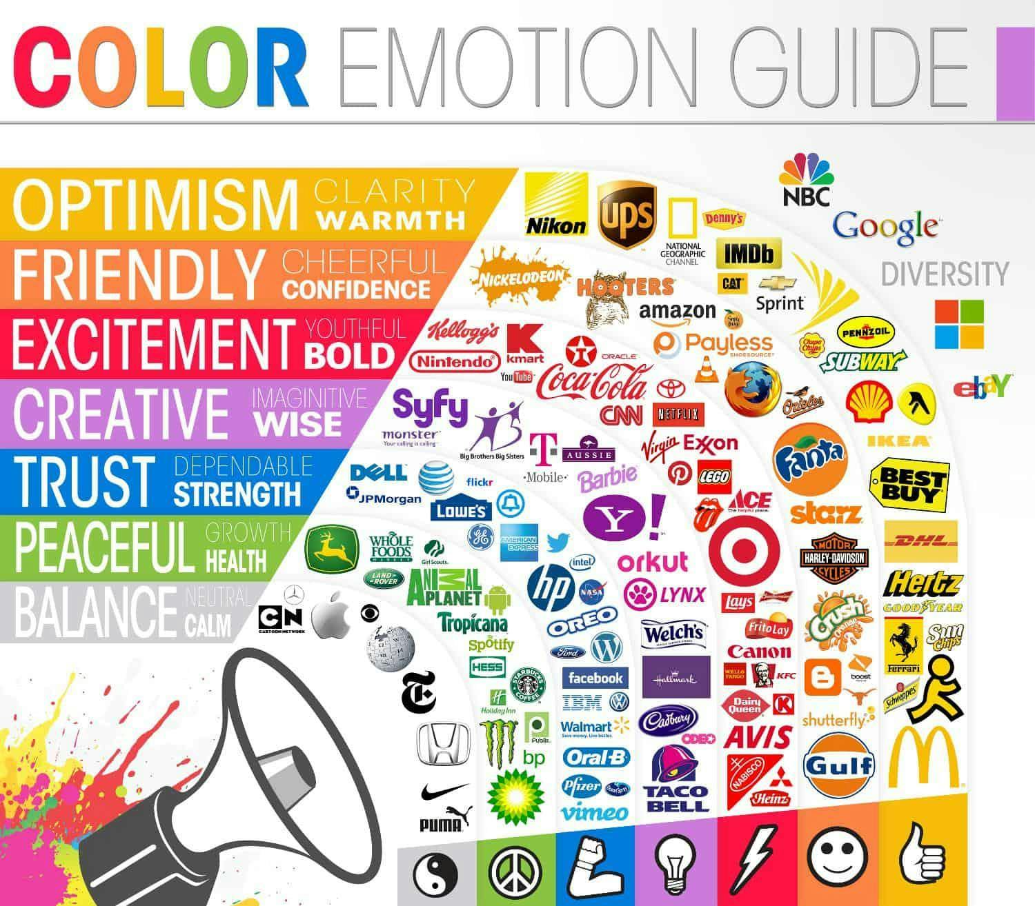
So how can you use color to better inspire action, instill trust and encourage buying behavior?First, you must get inside the mind of your target market. Next, take that information and look to the color wheel.What colors are behind some of the most successful brands and how can you tap into that emotion?
- Black conveys a message of power and authority. It speaks to a stylish and timeless message, imparting a sleek, formal, luxurious or classic experience.
- Yellow is seen as fun, joyous and optimistic. Brands like Nikon, Subway and Best Buy bear the brand of a bold, deep yellow.
- Orange is my brand color and one that embraces every aspect of my business. It's cheerful, inviting, encouraging, friendly and confident. Orange makes me happy!
- Red is a color that is emotionally intense. When we see red we think of “strength, adventure, energy and love.” It is extreme, exciting and vivacious with Coca Cola, Virgin and Pinterest embracing this vibrant hue.
- Blue makes us think of tranquility. It promotes a feeling of calm, and can symbolize loyalty. When we think about blue, we think of the words “unique, trust, reliable or clear.” Brands prominently displaying blue within their logo are Facebook, Dell, HP and Oreo.
- Green causes people to think about nature. It's calming and refreshing. Green symbolizes balance, growth, and freshness and can also speak to financial stability as green is the color of money.
TIP: Know Your Hex Color Code
Once you've identified your perfect shade, know the specific hex color code to maintain consistency in your images.Hex codes are six digit codes that represent universal values throughout the internet. You can easily find yours with the ColorPick Eyedropper or EyeDropper Chrome extension.
STEP 2: Identify Typography
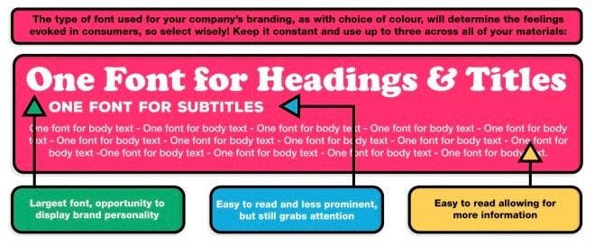
Think that typography is just a whole bunch of text on a graphic? Think again!The typography you incorporate into your visual content is as much a part of your brand story as your color choice. It expresses your company personality and has a direct impact on conversions.For example, your headings and titles should be easy to read and understand.They should also be eye-catching and attention grabbing. If you want your graphics to spread like wildfire, don't leave anything to chance.Test the structure, layout, color and typography of your graphics. From social media visuals to Infographics and Calls to Action - ensure that there is consistency in your design and message.Make it easy for your audience to take in your message and take action on your content.
TIP: Understand Font Descriptions
- Serif fonts feature a line at the end of each stroke. It conveys a traditional and professional message.
- Sans Serif fonts will not have a line at the end of each stroke. It illustrates a crisp and modern image.
- Script fonts, as well as italics communicate sophistication and femininity. These can be used for formality and decoration.
- Handwriting fonts appear to be personal and casual. This shows viewers that you are friendly and approachable.
- Display fonts vary in style and design. Choose these for text only logos as they are unique and creative.
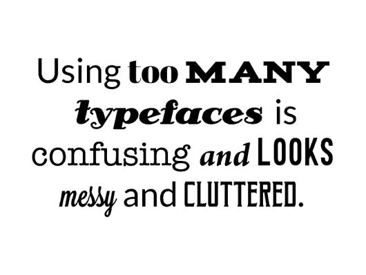
As Canva points out, using too many typefaces can be cluttered and chaotic.
STEP 3: Use Consistent Imagery
Use a consistent theme in your images and filters that complement your brand.Using filters can add a consistent look and feel to the pictures you use. If you utilize the same filter for all or most of your pictures, you can strengthen your brand.

To pick out a photo filter, decide which effects work with your color palette and fonts. Figure out what you are trying to convey to your audienceDo you need a filter that looks colorful, fresh, cool or urban? Or is your brand dark, retro or vintage?Use online editing tools like Canva and RelayThat to create unique images that are similar in form, follow a theme, or look alike.
TIP: Create a Themed Series
If you're creating content you need to consider repurposing. After all, why reinvent the wheel on a daily basis when you have loads of content at your fingertips?For example, create an image from tips or quotes found within recent blog posts. The image should have a consistent theme to make it easily recognizable.Here's a series we created for #InfluencerChat. Each graphic - no matter the social network - has a streamlined look and feel.
A photo posted by Rebekah Radice ⚡️ Social Media (@rebekahradice) on Aug 25, 2015 at 3:45pm PDT
STEP 4: Design Your Perfect Style
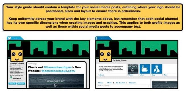
Build a style guide that contains a template for your social media posts, including where to position your logo and what sizes and layout are appropriate for each social media channel.Although each social network has unique guidelines and specifications concerning image dimensions and placement, try to remain consistent with your presentation on every site.
TIP: Size Images for Each Social Network
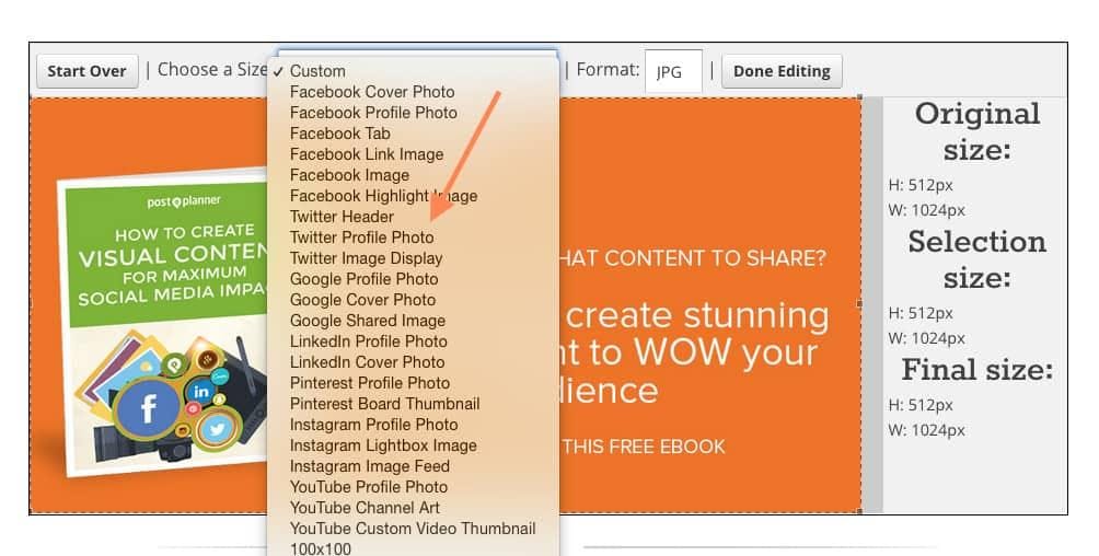
No two social networks are the same and neither are the image size requirements.Once you've created your style guide and a themed template, easily re-size it for each social network with the Social Image Resizer Tool.With this tool, you can finally stop guessing about image size requirements.
Final Thoughts
Still not convinced that visual marketing is taking the online world by storm?Take a look at these statistics!
- Social media posts with relevant images get 94 percent more views than content without.
- 60 percent of consumers are more likely to click on a search engine result of a business who has a picture accompanying it.
- Businesses that market using infographics receive a 12 percent increase in business on average.
- 93 percent of the most engaging posts on Facebook incorporate a visual of some sort.
There's no doubt about it. Adding visual marketing to your content strategy pays dividends that keep on giving.With the right visuals, you have the ability to clearly articulate your message and leave a lasting impression in the mind of your audience.
PIN and Share the Infographic

About Rebekah Radice
Rebekah Radice, co-founder of BRIL.LA, has traded narcissism for purpose. When not driving growth, you'll find her tricking family into thinking she's Emeril Lagasse - likely covered in marinara. The spotlight was fun, but impact is better. These days she's using 20+ years of brand brilliance for good.
