While you might not be able to judge a book by its cover, it’s often the cover that draws you in. The same holds true for graphics.
A compelling graphic is the eye-candy cover for your amazing content. It can pull your fans and followers in and keep them coming back for more. Together, the right graphic coupled with fantastic content is the makings of a powerful one-two punch.
Although I’m not a graphic designer, I do know what works from one social media network to the next. I’ve tweaked, tested, and modified my approach to find the best solution, no matter the audience.
Below are a few quick tips to help you get the most out of your social media posts through the power of a persuasive image!
1. Proper lighting goes a LONG way
For your graphic to look professional and appealing, it’s essential that it be bright, light, and easy to read. Avoid dark images, as many key details tend to get lost.
Take inventory and review your last several images, were they easy to read?
Could you easily scan and understand your message, or did it come across as a jumbled mess?

2. Use pictures to tell your story
Pictures are powerful.
They have the ability to persuade, motivate, mesmerize and enthrall.
They tell a unique story, connecting viewers with your message in a compelling and impactful way.
Whether humorous, controversial or emotional, telling your story through images can create massive results.
Disney has always done an excellent job of connecting their brand story to avid followers.
3. The rule of one
Did you know that in a one-hour talk, an audience can only retain one key point?
When it comes to your graphics, limit them to one point.
What is the one point you want to get across? Say it in a way that's compelling, creates a call to action, and speaks to your audience. Once you've determined your point, apply one of these rules to your post:
- Offer a solution
- Offer an answer to a problem
- Show “how-to” do something
- Encourage them to make a decision
- Tell a relatable story
- Inspire through “feel good” stories
A picture on social media is often-times worth more than a thousand words. Don't make the mistake of using pictures for the sake of having a picture.
3. Evoke emotion
There are only three reasons consumers buy. In order to sell your product or service, you must speak to a primal need.
- How to satisfy a basic necessity - food, clothing, shelter
- To solve a problem - what's their concern, challenge or problem
- Better themselves - better body, life, bank account
Once you understand your market, you can truly speak to their wants and desires.
If you know what they want, you can translate that into a powerful message in a minute. Petco does a fabulous job with this!
4. Speak in benefits, not features
Have you ever purchased a new car? What attracts you?
For me, it's the shiny. The shiny new cup holder, power windows, leather seats and of course, the easy access remote key.
So how can you speak in benefits to your clients?
Here are a few great examples:
This toothpaste says it has stain-removing properties. The benefit? You walk away with a brighter, better smile.
A car has anti-lock breaks. What does this mean? The car will stop and potentially save your family. That's a benefit.
This book has a ton of history lessons. Benefit? You'll be able to share special moments in time with your loved ones.
People buy based on benefits.
5. Use a fabulous font
From Arial to Times Roman, your font says a lot about you.
What are you trying to convey?
Decide who you are, what your business is about and how you want your message to be communicated.
Are you funny, serious, casual?
Each font speaks volumes about you and your business, putting a face and personality behind it.
5. Make every image your masterpiece
While your image might not be the Mona Lisa, it can be branded with your signature look and feel.
Customize each image to inspire and delight your social media fans and followers.
Ask yourself how you can make your image funny, inspirational, more informative.
The four basic questions you must answer:
- What is it?
- How does it work?
- Who has it?
- How does it feel?
Make it a game. With every image you create, make certain you can answer each question.
6. Ditch stock photography
While stock photography has a purpose and place within the online world, using it within your own marketing can hurt rather than help your cause.
Not only can it create brand confusion, but stock images put the “cookie cutter” stamp on your brand.
Ana Hoffman pulled together an amazing collection of professionals that consistently create and share images that ditch stock photography to create a perfect look and feel each time.
If you are going to use stock photography, make sure you're using them legally. Want to find useable images? Take a tip from Sara Hawkins!
7. Brand it baby
Your graphics should be a direct reflection of your business, both offline and online.
Take the time to create a seamless interpretation of your offline brand and weave that into all of your online content. This includes the look and feel of your images.
What are you trying to portray with each image? What is your goal and what emotion are you eager to arouse?
Each image is an opportunity to create a feeling of familiarity between business and consumer. Now streamline your look and feel across all of your social networks.
Graphic designer, Louise Myers is not only consistent but consist in producing professional graphics that complement her established online reputation.

8. Use tools to make it AWESOME
Graphic design tools can take your social media images from so-so to sensational. I have used Photoshop for years and while that’s my go-to tool of choice, I have found several other online tools to be a huge time saver.
They’re also created with everyone from the novice to pro in mind. So, no matter your skill level, there’s a tool that will allow you to quickly and easily draft a beautiful graphic.
My Top Two Options:
PicMonkey is a simple image editor that can be accessed online or via your desktop.
With PicMonkey, you can quickly add text to your latest photo of a brilliant sunset or start from scratch to create a branded image.
Either way, PicMonkey makes image creation and editing effortless!
Canva
Haven’t mastered Photoshop? No worries! There’s Canva.
Whether you want to design an image for your latest product or a collage from your latest speaking event, Canva makes it simple to transform your ideas into a unique graphic.
Canva offers templates and a user-friendly interface in an easy drag-and-drop environment.
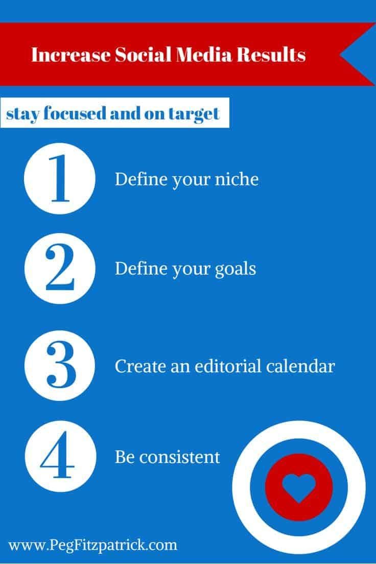
Wonder how to create your own attention-grabbing images? Just take a look at the example below from Peg Fitzpatrick to see how you can take your graphic from blah and boring to bold, beautiful and pinnable!

Want to attract, engage and boost your social media visibility?
Design an image that inspires your Google+, Facebook, Pinterest, and Twitter followers to take action!
About Rebekah Radice
Rebekah Radice, co-founder of BRIL.LA, has traded narcissism for purpose. When not driving growth, you'll find her tricking family into thinking she's Emeril Lagasse - likely covered in marinara. The spotlight was fun, but impact is better. These days she's using 20+ years of brand brilliance for good.
