Every so often, popular social media sites like Facebook, Twitter, and Instagram change the format, layout, and style of their networks. Just when you feel comfortable with the most recent image size guidelines, along comes a whole new round.
It can feel like a never-ending battle to keep up with the latest social media image sizes. From cover photos to the exact right dimensions for posts, managing it all can feel impossible. To help you make the most of your online presence, I've put together an essential list of social media image sizes for the top eight social networks.
You'll also find best practices and examples that show you how to leverage graphics to build awareness, interest and engagement. To make it easy, click on each link to skip to your favorite social network, then save or pin the Infographic via Set Up a Blog Today.
Skip to a Social Network
- Header Cover Photo: 1500 x 500
- Profile Photo: 200 x 200
- Shared Image: 1024 x 512
- In-Stream Photo Preview: 520 x 254
Your Twitter profile offers several ways to use images to stand out. First, you have your header photo. Just like your cover photo on Facebook and Google Plus, Twitter’s header image is your branding opportunity.
Use your header image to align your look and feel, marketing message and company tagline. And before you throw away a chance to brand your business, know the answers to a few questions.
- Who is your target market?
- How do you help solve their problems?
- What is your call to action and what next step do you want them to take?
Additionally, the Twitter in-stream photo is a great way to brand your tweets and grab the attention of your followers. Are you using images within your tweets? If not, now is the time to get started.
While the Twitter preview size is 520 x 254 (a 2:1 ratio), I’ve found that an image size of 1024 x 512 pixels works perfectly within the feed.
To determine what text will show up within your image, you could use this formula from Laura Rhoeder: "Divide the width of your image in half to find the 2:1 ratio and the number of vertical pixels you have to work with. Now divide the in-stream preview height in half. Using the same example as above, you would divide 1024 in half to get 512.
From the horizontal line in the center of your image (the Y-axis), move up that number of pixels (e.g., 512) on the Y-axis and draw another horizontal line. Do the same thing again, but moving down the Y-axis from the center of the image. Everything inside that blue box is the in-stream preview.
The blue box aligns with Twitter’s 2:1 template and is centered vertically to keep the best part of your picture visible."
Or, you can make it easy on yourself and create your images in a tool like Canva or QuotesCover that will help you determine where to place your text.
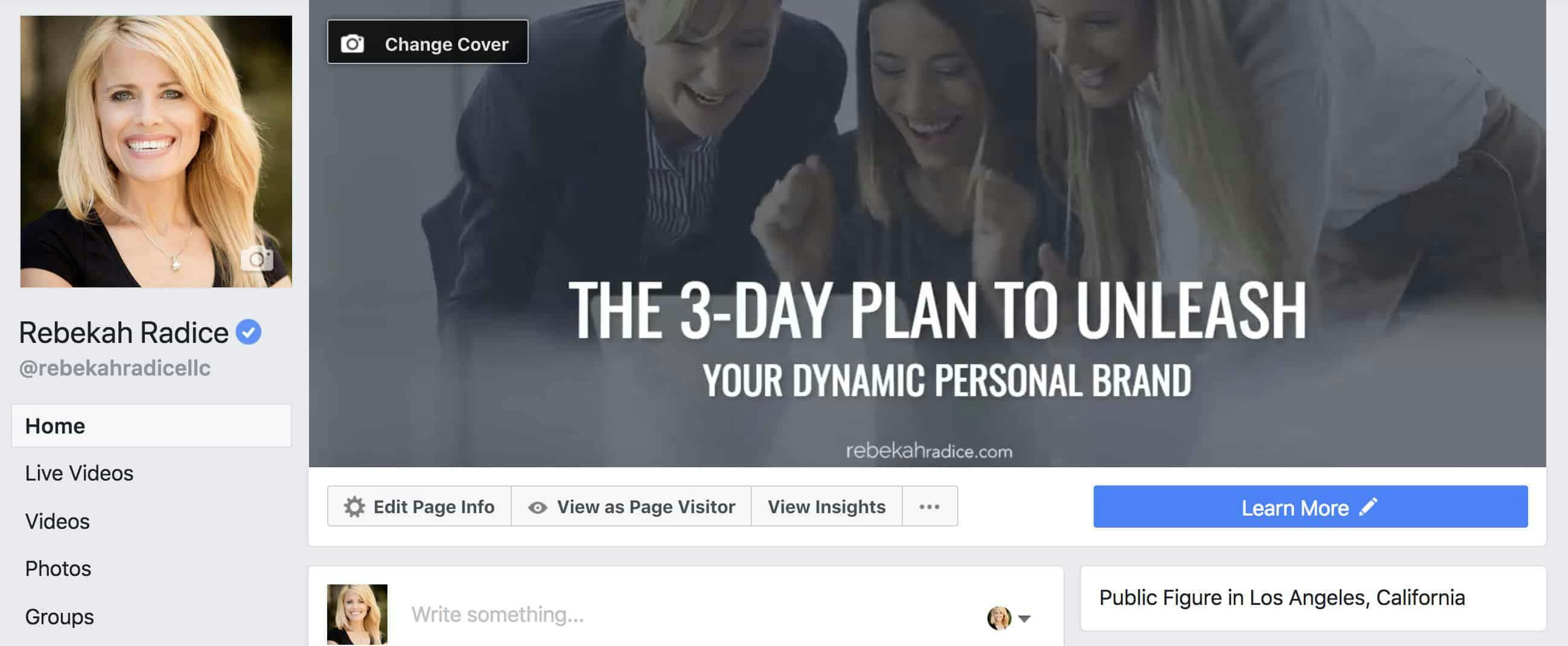
- Page Cover Photo Dimensions: 820 x 312
- Group Cover Photo: 820 x 428
- Profile Cover Photo: 851 x 310
- Event Cover Photo: 500 x 262
- Shared Images: 1200 x 630
If you're ready to turn up the volume on your business and gain the edge over your competition, it's time to get visual on Facebook. Meaningful Facebook conversations begin with great content, this includes the images you share.
Use your Facebook cover photo and newsfeed images to connect fans to your brand. Whether it's a picture of your latest business offering or one that promotes your recent blog post, make sure the look and feel best represent who you are offline and online.
Google Plus
- Profile Image: 250 x 250
- Cover Image: 968 x 545
- Shared Image: 502 x 282
- Highlighted Image: 502 x 892
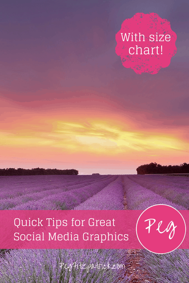
When was the last time you updated your Google+ profile or page? If your answer is, “I don’t know,” then now is the time. Did you know that posts including an image are 87% more likely to get shared than posts without? Peg Fitzpatrick, author of “The Art of Social Media” and social media power user seconds that,
“You can’t be guaranteed a share if an image doesn’t pull through on the Pin it button or onto Facebook or Google+. Help people help you by providing an image that they can share. If people can look like a rockstar sharing your content, it’s a win!”
Just take one look at her beautiful images and it’s easy to see why her content gets the shares it does.
- Profile Image: 150 x 150
- Photo Thumbnails: 161 x 161
- Shared Square Photo Size: 1080 x 1080
- Shared Vertical Photo Size: 1080 x 1350
- Shared Horizontal Photo: 1080 x 566
With more than 800 million monthly active users, Instagram has become a visual marketing social leader. Whether you’re sharing your latest blog post, business quote or helpful tip, Instagram has marketing super powers, no matter the industry or niche.
While completing your profile is incredibly important with any social network, this is especially true with Instagram since you’re limited in the amount of information you can share. That’s where the right visuals come in very handy. Use your graphics to better connect with your audience, tell your story and brand your business.
But keep in mind; you will need to crop your photos to fit within the social apps square dimensions. If you’re adamant about keeping the original dimensions of your photo, there are apps that can help.
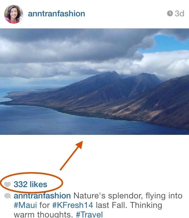
Ann Tran has great success with images that aren’t the traditional Instagram square. As you can see, her engagement on this post proves that mixing it up just makes sense.
- Profile Image: 165 x 165
- Board Display: 222 x 150
- Pin Sizes: 236 / X (no height limit)
Are you interested in marketing your business with Pinterest? Not only can a persuasive Pinterest image attract attention, but also inspire action and drive traffic to your website or blog. Don’t miss the opportunity to optimize your images for maximum engagement!
What you need to know:
Pins in the feed will have a width of 236 pixels and expanded pins have a minimum width of 600 with the length adjusted to scale. As Sprout Social says,
When adding a pin to your board, it’s important to remember that Pinterest puts a limit on the width of the image but not the length. This gives you the opportunity to add a photo that’s square or one that will scale to be even taller. Just remember to make sure you’re creating large images because they add more value, not just because you can.
I have had great success with larger images over the last several years, finding that larger images receive more repins, likes and clicks.
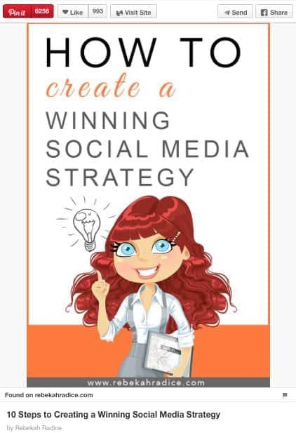
My perfect size is 735 x1200. However, don’t be afraid to mix it up and see what works best for you. This image, created over one year ago for the article, "10 Steps to Creating a Winning Social Media Strategy," is 600 x 900 and still sits at the top of Pinterest search for the keyword “social media.”
Tumblr
- Profile Image: 128 x 128
- Image Posts: 540 x 810
With over 738 million unique visitors worldwide and over 113 million posts per day, Tumblr is no lightweight when it comes to visual marketing. So, what do you need to know? Aside from the profile photo, which should be square, your second biggest concern should be the images you share.
Disney is a great example of a brand that understands the importance of creating network-specific content. Rather than sharing the same piece of content across multiple platforms, Disney tailors their content for this specific audience. Learn from their example.
Whether sharing a photo, video or GIF, think engagement and awareness when sharing your business content on Tumblr, Instagram, Facebook, Google Plus or Twitter.
A photo posted by Disney (@disney) on Jan 26, 2015 at 4:00pm PST
YouTube
- Channel Cover Photo: 2560 x 1440
- Channel Icon: 800 x 800
- Video Thumbnail: 1280 x 720
Since YouTube is a video-sharing site and not a photo-sharing site, your graphic focus will be your channel's profile image, cover photo, and channel art.What do you need to know about YouTube videos?
- In order to qualify as HD quality, they must be a minimum of 1280 x 760.
- Videos must maintain a 16:9 aspect ratio.
- Make it a point to choose the most catchy video thumbnail.
- Your videos tell a story. What are yours telling about you? Keep the most relevant videos at the forefront of your YouTube channel like my interview with Guy Kawasaki and Peg Fitzpatrick.
- Profile Image: 400 x 400
- Cover Image: 1584 x 396
- Update / Blog Post: 1200 x 628
- Company Cover Image: 1536 x 768
- Company Logo: 300 x 300
LinkedIn’s continued growth and move towards visual marketing make this an important place for your business to be. With over 500 million members, LinkedIn is growing at a speed of more then 2 new members per second. Does that sound like a place you can afford to forget about?
Spruce up your LinkedIn profile by adding a new cover photo (did you even know they allowed cover photos now?) and add consistent status updates. As Constant Contact points out,
While some may consider LinkedIn one of the least visual social networks, reports have shown that you can increase your LinkedIn views by 11 times when you include a photo. We have found that including a photo with the content we’re sharing on LinkedIn from the Constant Contact page typically doubles the engagement rate.
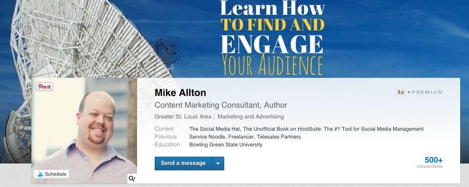
Mike Allton with The Social Media Hat makes this suggestion for a perfect LinkedIn cover photo, "Don't just upload an image you like — make sure that image communicates something about you and your business to prospects, and add text to help contextualize the image, or at least add additional information."
And his cover photo is an excellent example of making the most of this branding space:
Final thoughts
I use images to brand my business in a consistent way. From my cover photos to my social media graphics, it's easy to recognize my signature orange. How are you using images to brand your business? Think about what purpose they're currently serving.
Now decide how you can update your social media image sizes to create a memorable experience, no matter where anyone chooses to connect with you.
Pin the infographic

via Postcron
Updated June, 2018
About Rebekah Radice
Rebekah Radice, co-founder of BRIL.LA, has traded narcissism for purpose. When not driving growth, you'll find her tricking family into thinking she's Emeril Lagasse - likely covered in marinara. The spotlight was fun, but impact is better. These days she's using 20+ years of brand brilliance for good.
